Social Media Scorecard
Context
A global pharma aesthetics brand runs social accounts in dozens of markets — US, Mexico, Germany, and more. Each region operates on its own, but the brand needed to see who's ahead and who's lagging.
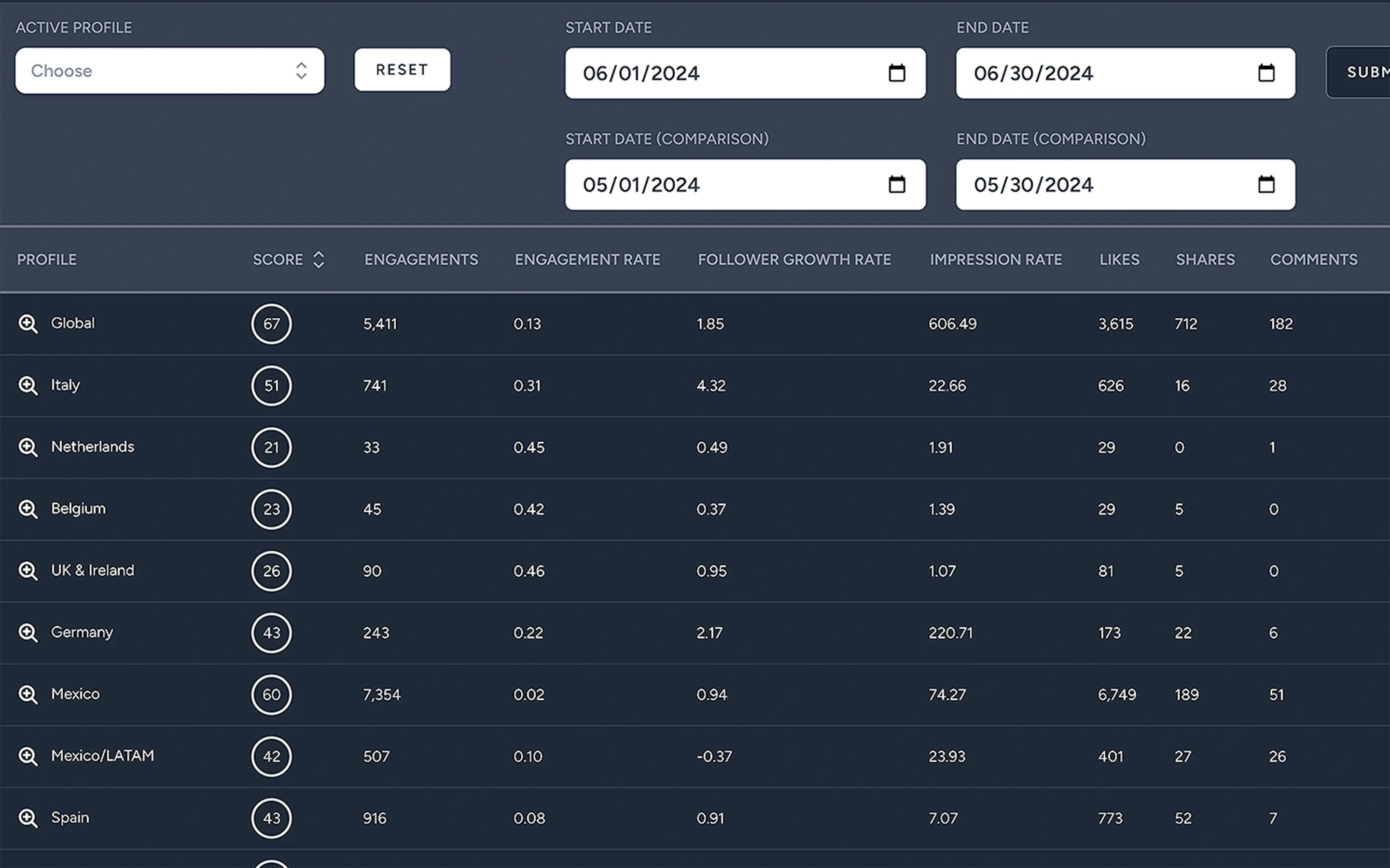
The tool: pull metrics from Sprout Social, score each profile against its peers, show the results in something brand managers can actually use.
How the scoring works
Eight metrics per profile for a date range:
- engagement rate, likes, comments, video views, and others
Each metric gets a 0–100 score using a logarithmic, peer-relative formula — you're compared to other profiles in the dataset, not some external benchmark.
The overall rating is a flat average of those eight scores. Profiles rank by rating within the dataset.
Detail views use donut and bar charts for per-metric breakdowns, color-coded by band:
- 0–40: red
- 41–70: yellow
- 71–100: green
The main table shows the rating plus raw numbers — likes, comments, views. The per-metric scores drive the pretty charts.

What the scores actually mean
This is relative benchmarking, not a grade.
A score of 80 means you're beating most peers in this dataset. It does not mean you're objectively good at social media.
That matters:
- You can score 85 while doing badly — if everyone else is worse
- The same profile can jump from 45 to 65 with zero real change — a peer had a big month and shifted the distribution
- Log scaling keeps one outlier from dominating, but scores only mean something compared to each other
For a global brand, that's the point. It answers "which regions are lagging?" not "is Germany good at Instagram?" Different questions.
Gaps
No guidance layer. Germany at 42 means Germany is behind peers — not "post more video" or "fix response time."
Per-metric scores exist but live in charts, not as action items. If video views are killing the average, that should be visible and labeled — not buried in a donut chart. The data's already there; it's a presentation problem, not a technical one.
We tried weighting metrics — engagement rate over raw likes, since it normalizes for audience size — but landed on a flat average. Simpler to sell internally.